One of the key skills that will set you apart as an analyst is the ability to provide management with a distilled view of the key company numbers, with the ability to have multiple views in interactive Excel Dashboards. Surprisingly, using shapes for stylish Excel dashboards is one of the little known concepts.
In my career as an Excel specialist and trainer, I’ve noted tremendous time savings on those students who have gone through our Excel dashboards course.
The good news is that Microsoft Excel has continued to make improvements that allow the process and available visualizations (charts) easy to generate.
For instance, with Excel 2016, you have a Waterfall chart as a standard chart. With Excel 2013 and prior versions, however, creating a waterfall chart for instance, would require some tweaking, but yes, it is achievable (follow the link to learn the 4 steps).
In this article, we will focus on the following key concepts.
- Custom calculations in Pivot Tables
- Adding interaction to dashboards with slicers
- Custom number formats and conditional formatting
- Using shapes for a prettier excel dashboard
- Applications of VLOOKUP + MATCH and named ranges
You can download the file used to follow along.
Based on the data set at hand, we shall look at the following metrics for a given user-selected year:
- Year-to-Date (YTD) sale
- YTD sales margin
Further, in a dashboard, it is good practice to provide context for the various metrics one chooses to display. In this respect, we shall also indicate the YTD sales for prior year and the Year-on-Year (YoY) growth rate.
If you would rather watch the video you can download this version of Excel file to follow along.
Prepping your data
In the data extract, we are given the sales date. From this, we’ll need to (1) identify the year and (2) identify dates that will be included in the YTD.
Extracting the year from a date
To start with, given the sales date, we can generate the column for years using the following formula:
=YEAR (F5)
Determining the YTD dates
For the year-to-date (YTD) filter for our report, we would need to identify the dates that fall between “1-Jan” for any given year and today’s date (or equivalent of today’s date for prior years). Notice, for those companies whose financial year doesn’t start in January, you can adjust to the respective starting month.
We shall apply DATE Functions as follows:
- First generate the start date, i.e. “1-Jan” for any given year. For instance, if the sales date is for year 2014, then you will have “1-1-2014”, and so on. This is the formula in cell J5.
=DATE ($I5, 1, 1)
- Generate a date (End date for this example) that is equivalent to today’s date for the various years (column I) in our data. We’ll use this formula in cell K5.
=DATE ($I5, MONTH (TODAY ()), DAY (TODAY ()))
- We then combine (1) and (2) above using an IF and the AND function to generate a column that will be used to filter our analysis to transactions that fall within the YTD window.
=IF(AND($F5>=$J5, $F5<=$K5), “YTD”, “Other”)
We will end up with four extra columns as shown below:
For a detailed understanding of these and other functions discussed in this article, you may need to attend our live training events.
The Analytics
Having prepped the data as guided in the section above, we shall then compute these YTD metrics:
- YTD Sales, Profit Margin & Margin as a percentage of sales –user selected year
- YTD Sales, Profit Margin & Margin as a percentage of sales –prior year
- Year on Year Growth (YoY%)
To achieve this, we insert a Pivot Table [from Insert Menu on the Ribbon] and place the Year field in the Row labels of the pivot report grid, Sales field in the Values box and the YTD field as a Filter.
With MS Excel 2010 and higher versions, once you insert a given column, say Sales, in a Pivot Table, you can rename it to a more meaningful name in the report. In this example, we have renamed it as Turnover [i.e. from Sum of Sales to Turnover]. We shall be doing this more often in our report to enhance how the report looks.
YoY Growth field:
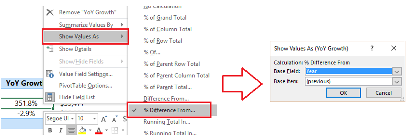
In the report above, we have dragged sales column (the second time) to the Values section in the field list drop zone. Then as shown in the figure below, (1) right click the values in the report and (2) change the display under “Show values As” to “% Difference From…” and (3) from the dialog box that pops up, choose ‘Year’ as the base field and ‘Previous’ as the base item.
In Excel 2007, if you want to change the display to % difference from… as per the above screenshot, you would need to right click and choose the Value Field Settings… instead. From the screen that appears, choose Show Values As and select “% of Total” as the calculation type.
Profit margin & Margin as % of Sales
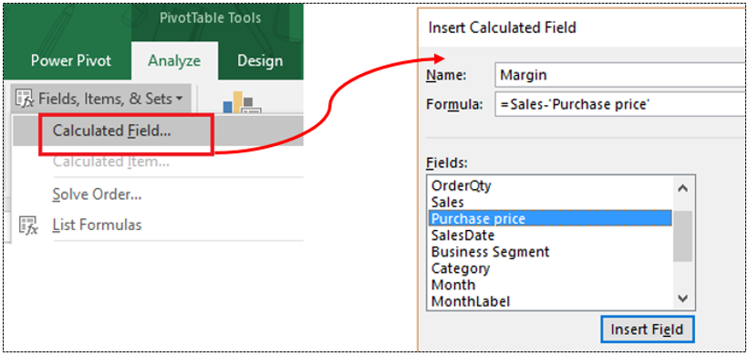
These two fields are computed as Calculated fields in Pivot Reports. To create the two fields, select any cell in the pivot report you have already created. From the Analyze menu (or Options menu for MS Excel 2010 and 2007) select Calculated Field… as seen in the figure that follows. Type “Margin” as the field name and insert the following formula (Double click a given field to include it in the formula).
=Sales-‘Purchase price’
In a similar manner, insert a calculated field for the margin as a percent of sales.
The Dashboard Display Page
For interactivity of the dashboard, we cannot link directly to the report generated in the previous section. We need to extract the info (using Excel formulas) based on the user selection on the dashboard. In our example, the main driver or report slicer is the year.
Inserting the Year Slicer
Insert another pivot report but this time round we include the Year column only in the Report Filter.
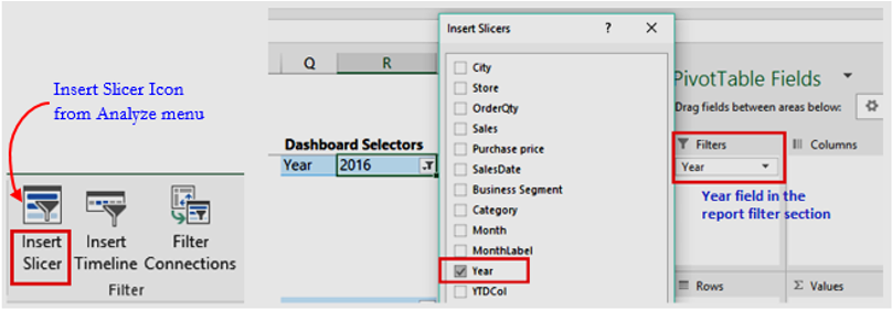
Further, go to Analyze menu (or Options menu for MS Excel 2010) and insert a slicer by clicking the Insert Slicer icon…
NOTE: Excel 2007 doesn’t have slicers and you may need to explore a drop down list or form controls instead.
The cell with the year (R5) in the figure above is named selYear (right click on the cell and choose “Define Name…”).
Next, we use formulas to extract data to be displayed in the dashboard.
When a user selects a given year from the slicer on the dashboard page, we want to view the Turnover, YoY%, Margin, and Margin as a % of sales -for the selected year versus prior year.
- In cell Q23, we type “=selYear” so that this is controlled by the user.
- In cell Q24, we use the formula “=selYear-1”
- At this point, we shall employ VLOOKUP and the MATCH function to retrieve the above metrics based on the selected year. The formula in cell R23 is as follows:
=IFERROR (VLOOKUP ($Q23, $Q$14:$U$18, MATCH(R$22,$Q$14:$U$14,0), FALSE), “n.a”)
The MATCH function is used here to provide the column-index required by the VLOOKUP. We have standardized the labels/headers (Turnover, YoY Growth, etc.) to aid the MATCH function. The IFERROR function traps errors that may arise and displays ‘n.a.’ instead.
Having the metrics to be displayed in the dashboard, we’ll now use the following to build the dashboard page:
- Shapes
- Picture Links and/or camera tool
- Colour coding
The Dashboard Page
Open a new worksheet and do the following (join our Excel Dashboards class for detailed explanations):
- Go to View Menu and remove gridlines (uncheck the Gridlines box)
- Select the Year Slicer inserted above -cut and paste it in this worksheet
Using shapes for stylish Excel dashboards
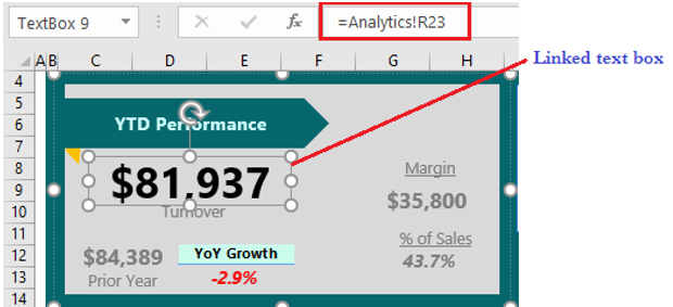
- In the Insert Menu, insert various Shapes from the Illustrations group. For this example, we have used these shapes: rectangle, the pentagon, a text box and an isosceles triangle. The idea is to layer the shapes cleverly by adjusting each shape’s “Bring to Front / Send to Back” positions. You will love inspirations by datapigtechnologies for stylish Excel dashboards using shapes! Ideally, once you insert a shape and you wish to link it to a value in a given cell, make sure the shape is selected from its edges (i.e. the cursor is not blinking inside the shape), click inside the formula bar, press = and select the cell that has the value you want to point to.
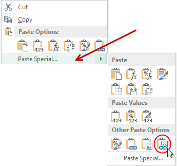
- The YoY Growth is a linked picture. To do this, go to your analytics page and copy the cells you want to link. On the dashboard page choose Linked Picture as seen below.
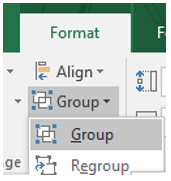
- Once you have neatly arranged the shapes and linked them to the relevant numbers, SELECT ALL the shapes (this will activate the contextual Format menu for shapes), then choose Group. This helps to move the shapes without interfering with the feel of the dashboard.
Take a look at the completed Excel Dashboard and play with it!…
Do you use shapes for Excel Dashboards? Share your experience and tips using comments.
What next?
Working with shapes to achieve a stylish finish to your Excel dashboards is just one of the concepts that you need to master. This article doesn’t go into a lot of details on how other parts come together to build a functional dashboard. You’ll benefit more by attending one of our bi-monthly Executive Excel Dashboards live sessions.




![Power BI DAX Measure [Crack the Challenge]](https://datacycleanalytics.com/wp-content/uploads/2019/05/DAX-Challenge-500x383.jpg?x66433)
![Highlight High and Low Points in an Excel Chart [The Right Way]](https://datacycleanalytics.com/wp-content/uploads/2019/04/Highlight-High-and-Low-Points-in-an-Excel-Chart-500x383.png?x66433)

